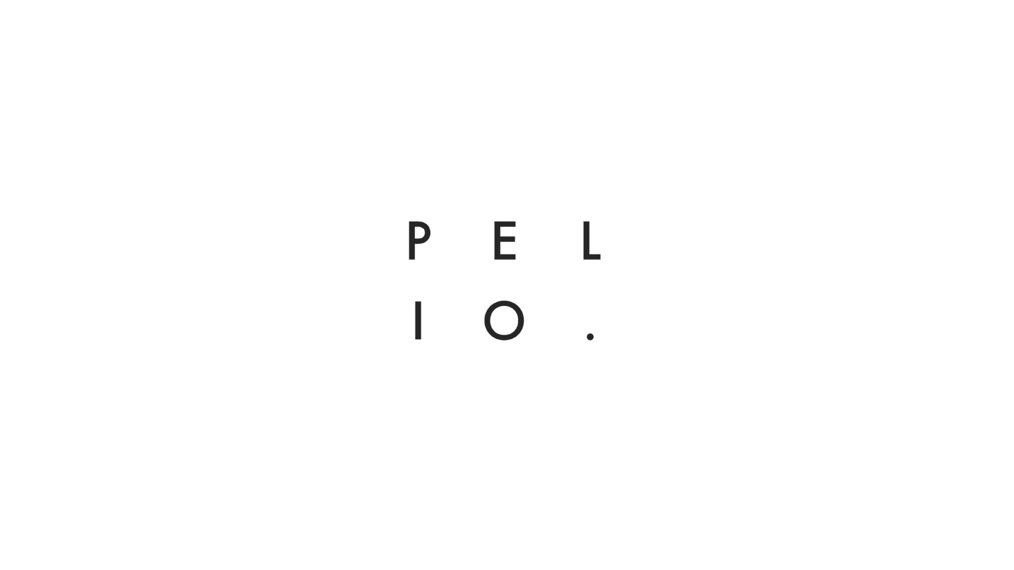
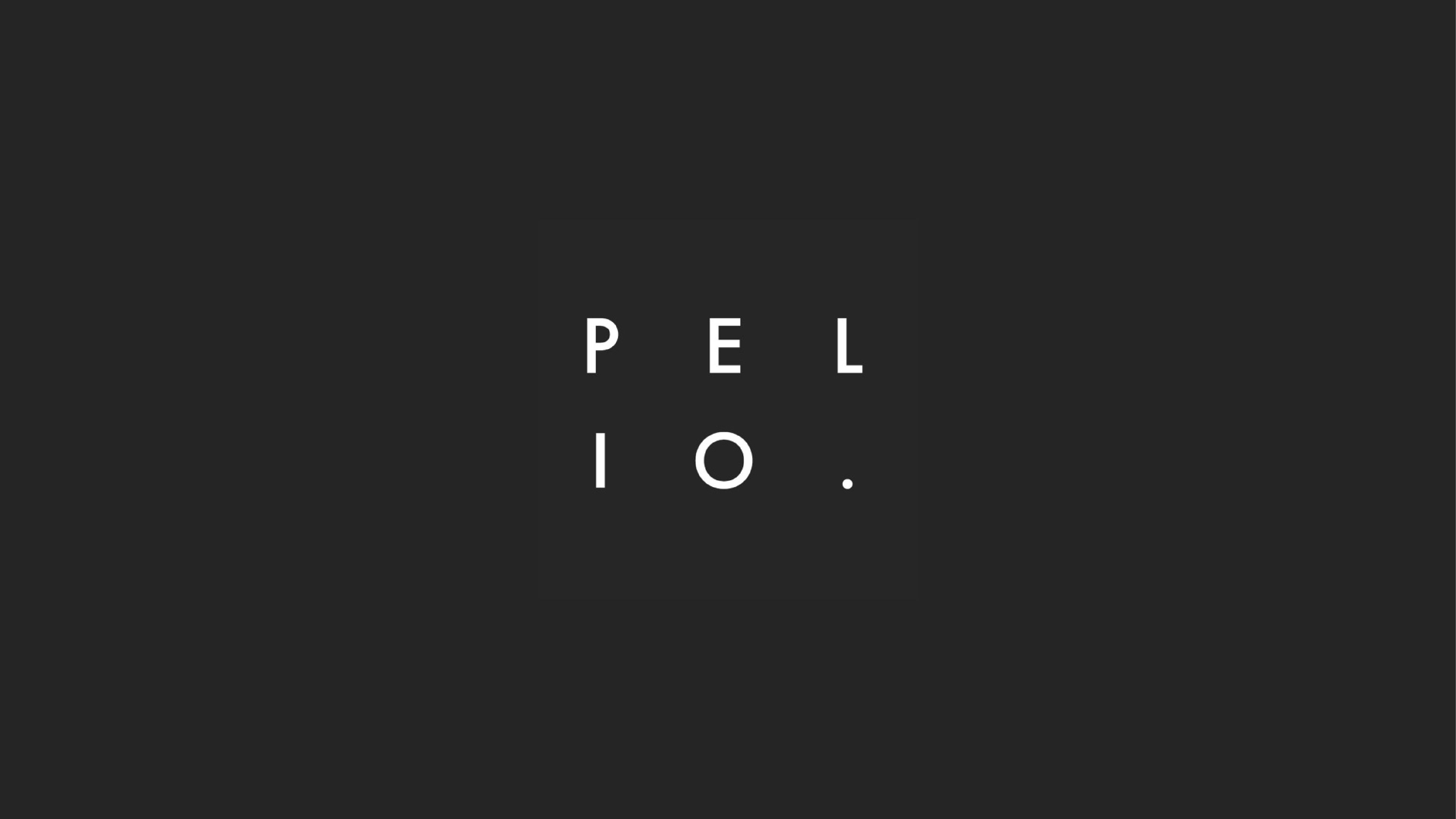
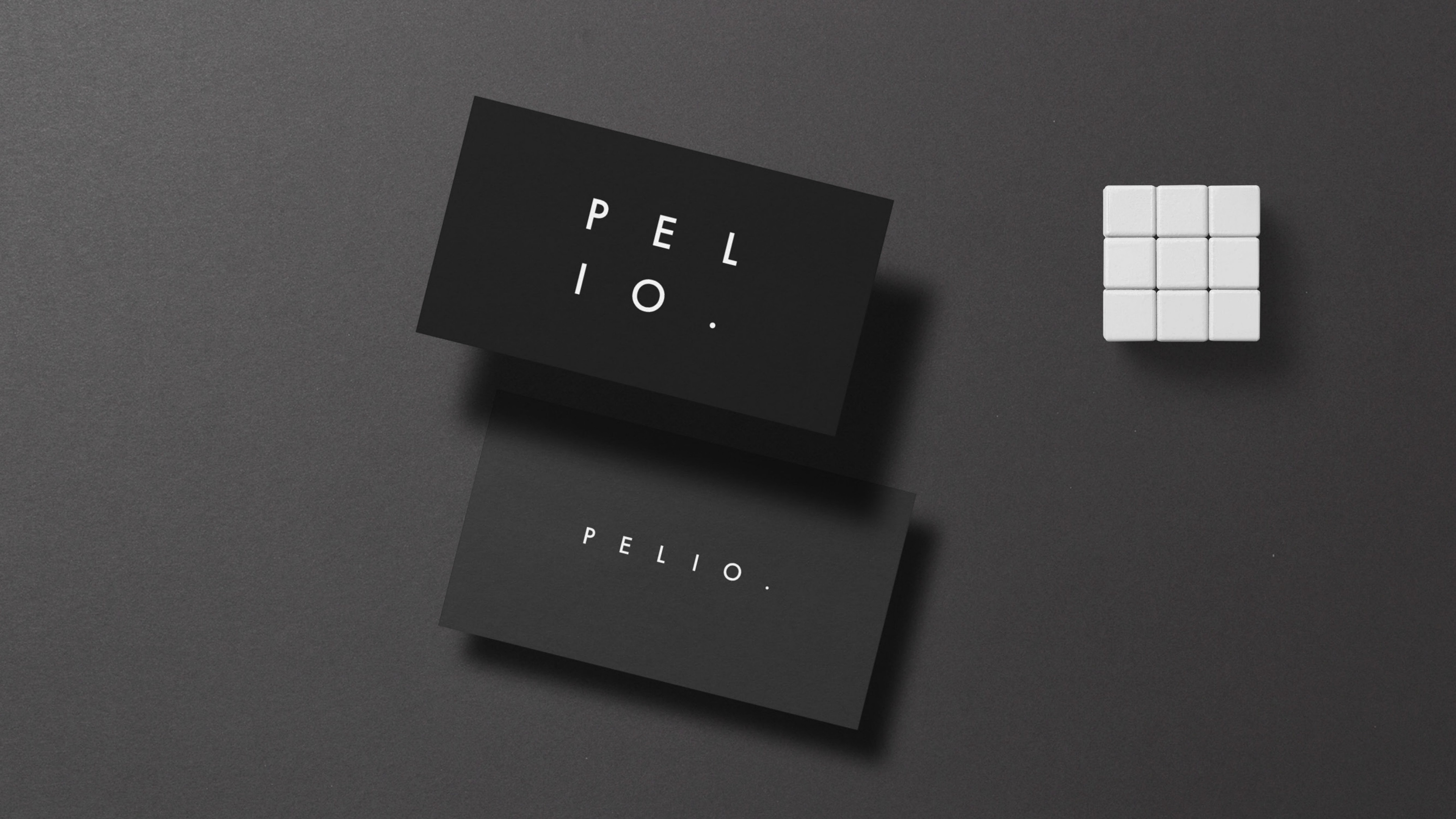
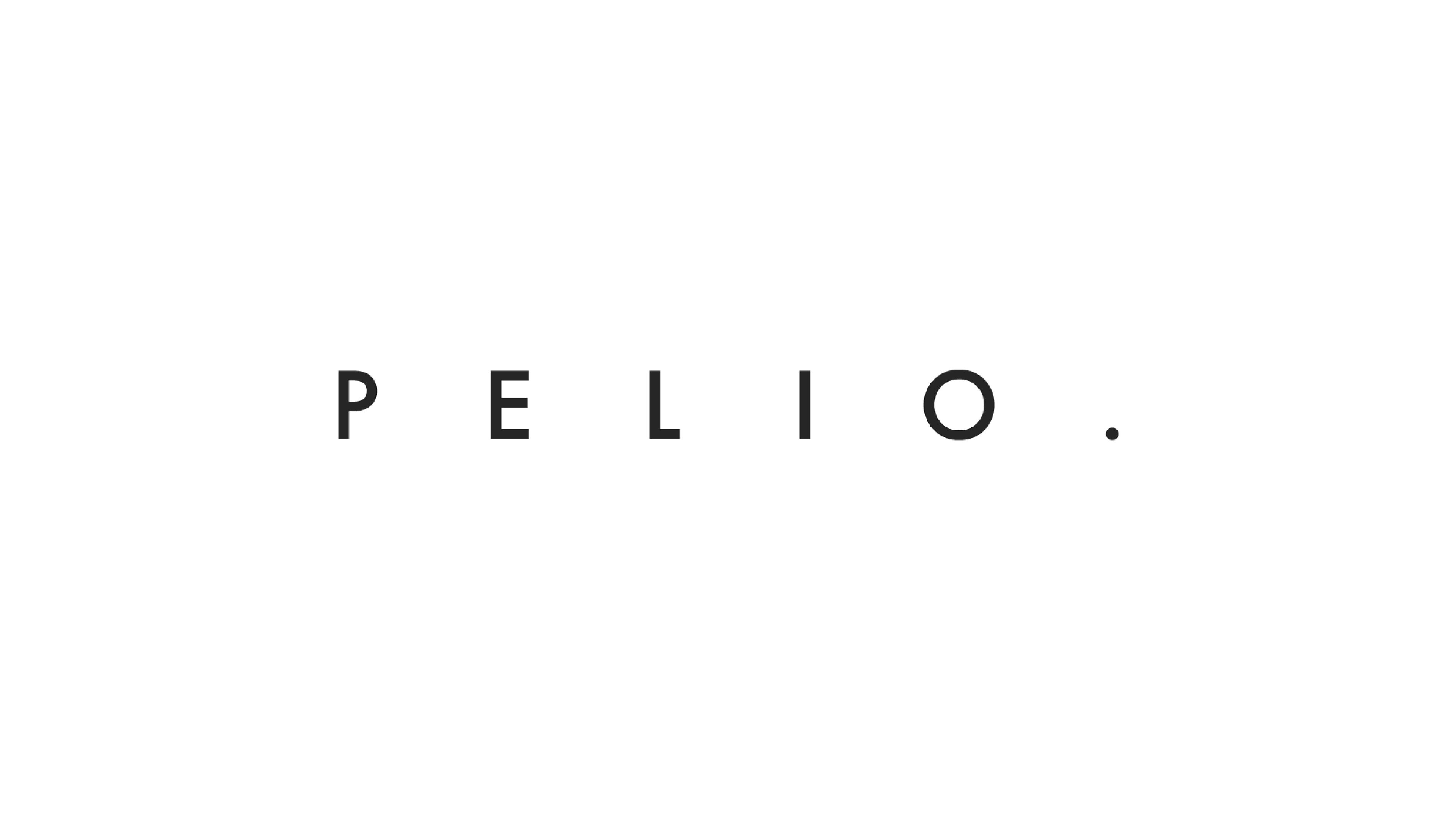
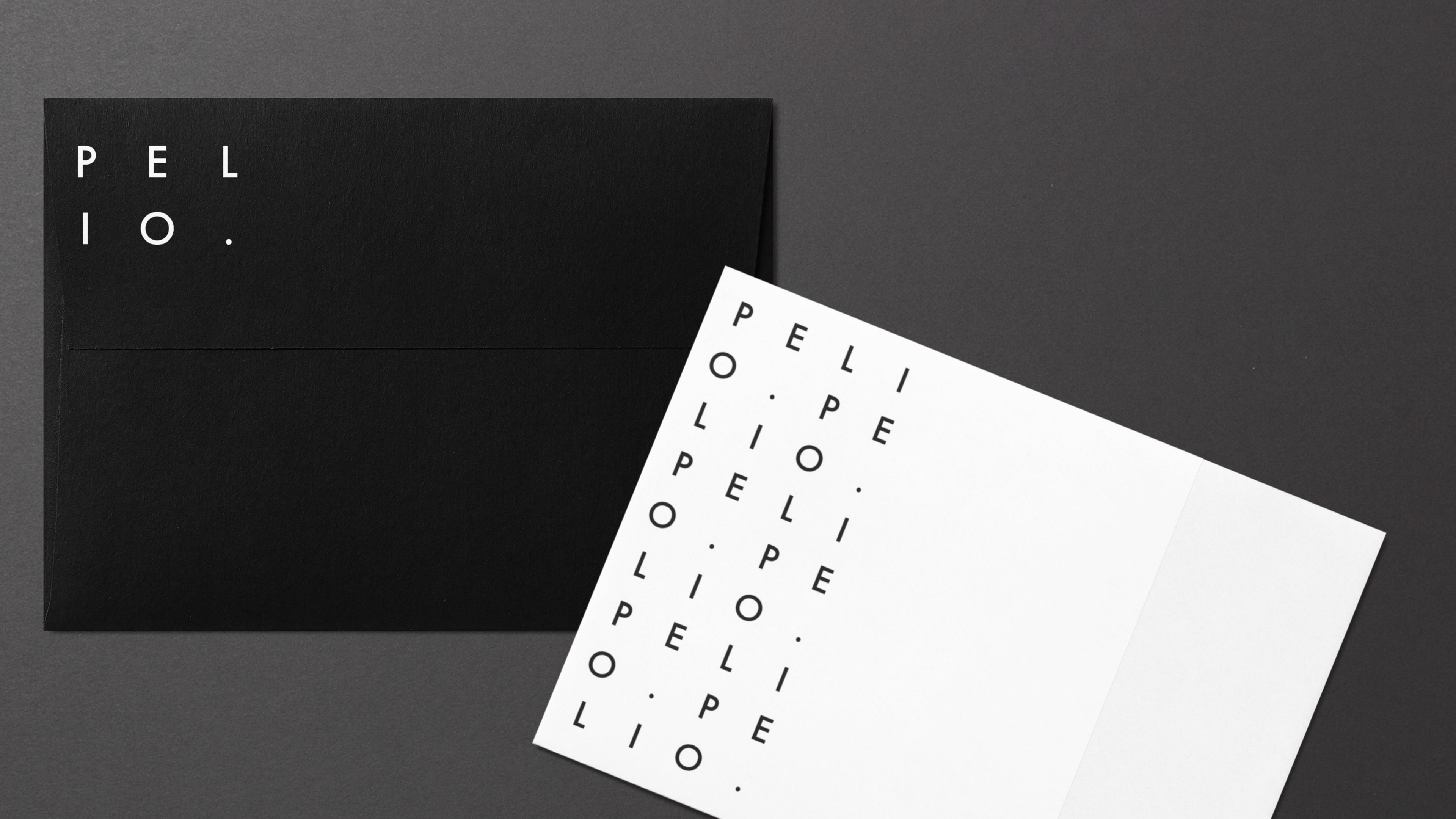
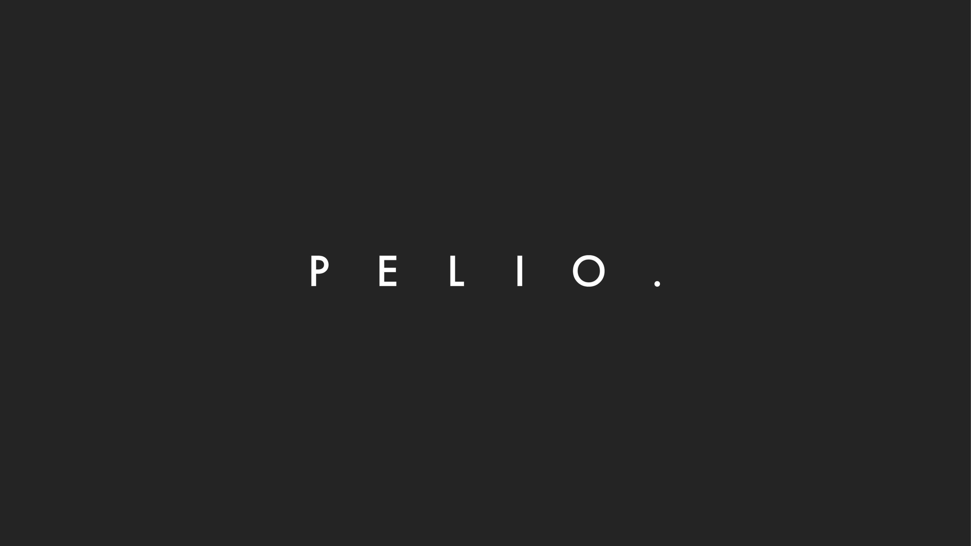
The Pelio Studio logo embodies the essence of this family-owned business, harmoniously combining design prowess with analytical insight. As a company that navigates complex structures and information with ease, the logo's design choice reflects a careful balance of structure and organisation.
At first glance, the logo presents an impeccable alignment of letters, perfectly synchronised in a straight line, symbolising the seamless coordination and precision that Pelio brings to every project they undertake. This deliberate arrangement also echoes their adeptness in handling intricate information in a well-organised manner.
Typography plays a pivotal role in the logo's expression. The sleek and sharp font exudes a sense of sophistication and modernity, mirroring the expertise of Pelio's creative specialists. The design is crafted meticulously, reflecting the brand's commitment to delivering high-quality and refined design solutions.
The colour palette is thoughtfully chosen to evoke a feeling of trust and professionalism. Hues of black and sophisticated grey exude a sense of reliability and stability, underlining Pelio's capability to address intricate design challenges with poise and confidence.